A logo is your business’s first impression and lasting message. It’s your thumbprint, a simple identifying mark that contains an identity. It’s also the thing you’ll have on the wall, on your letterhead, on your t-shirts and on and on.
A company’s logo is the first line in its story. Telling a story is Coal Creative’s specialty. While storytelling is more literal in a blog or a video, the same care and curiosity goes into creating logos.
Sam O’Connell, Chief Creative Officer, and Matt Simoncavage, Lead Web Developer and Designer, are the veteran designers behind many of our collaborators’ logos. I asked them to share some of their logo-crafting knowledge with you.
It should be noted that Content Director Samantha Bucher is also a huge contributor to our logo and graphic design endeavors. She was off directing content or polishing off some dope logos during our interview. So, you’ll just be reading the capable and experienced voices of Sam and Matt in this here blog.
So, where to begin?
Logo Creation Step One: Know the brand
When a collaborator seeking a logo walks through our door — or more likely logs on to a Zoom meeting — our designers enter into an exploratory phase. They first need to learn about the basics of the business or organization and what they do. This usually includes some history, details about their services or products and their mission.
“I try to get a spark there between their name and their services,” Matt explained.
They also explore what the person prefers in terms of color and style. This includes other logos that they like or dislike. These seemingly general questions set the designers off on their way.
Logo Creation Step Two: Research
Once a designer has a firm understanding of the business, it’s important to understand the rest of their industry. It would be unfortunate to create a logo for a tire company that on the surface is a perfect fit, but uses a similar font or image as a competitor.
“There is a heavy reference phase,” Matt said. “I usually saturate myself in Google images and keywords.”
This phase can spark ideas. It can also steer a designer away from overtread ideas (sorry, I’m still thinking about the fictional tire client). Ultimately, this research phase gives a designer a solid footing in the industry so they can see what’s working, what’s not and where there is space for innovation. The goal is to create a logo that makes sense, but stands out from the rest.
Logos with a Purpose
A logo that makes sense — or one crafted with purpose — is all mapped out for a reason. The colors, the icons, the symbolism, even the fonts are there for a reason.
“It’s so important how your brand looks. The logo should be interesting, memorable and simple,” Sam said. “A good logo is clever.”
Armed with the brand’s story, their competition and the aesthetics of the industry, Matt and Sam start designing — with purpose.
Matt strives to make a logo with legs — something that can stand on its own. A logo with legs is identifiable and functions well in different situations (think t-shirts and billboards).
He asks himself questions like “does this have a function? Does it do something?” All in the pursuit of a functional and declarative finished product. Said another way, nothing is done just to do it.
Logo Creation Step 3: Design
Now, it’s time to get things down on paper — or more accurately — on a computer screen. The Coal Creative team uses Adobe Illustrator to design logos. They create vector art — a file format that allows for clean graphics that can be scaled up and down without compromising the look. Adobe has an excellent explainer of vector artwork here.
With the backing of research, Matt and Sam set off to create some designs.
“Every designer has a toolkit of things they go to first,” Sam explained. “You test the waters with a few fonts. I have a favorite serif and a favorite san serif.”
This toolkit of familiar elements is the ground floor on which the rest of the logo is built.
Our Collaborative Process
Coal Creative is a collaborative company. In that spirit, Matt, Sam and Samantha often send logos — in various stages of completion — back and forth. A fresh perspective can elevate an idea that is falling just short of the mark. While collaboration is the name of the game, this process leads to some healthy competition. Matt and Sam agree that seeing something awesome from the other drives them to up their skills.
Logo Creation Step 4: Logos for Every Occasion
As we’ve discussed, a logo is used in a lot of different places. Those different situations often call for variations. In some cases a colorful logo will be printed in black and white. It’s worth testing that the logo still works without the color.
Say a logo is being printed among others in a sponsorship list. In this example a horizontal logo would look best. If a logo is rigidly vertical, it will look out of place. If there is an alternative logo or a way to shift it more horizontally, it’ll look like it belongs.
Separating Words and Icons
In cases where a logo has words and imagery — like the Coal Creative logo — it’s important that the elements work separately as well. The Coal Creative wordmark can also be used with or without the tagline.
A Family of Logos
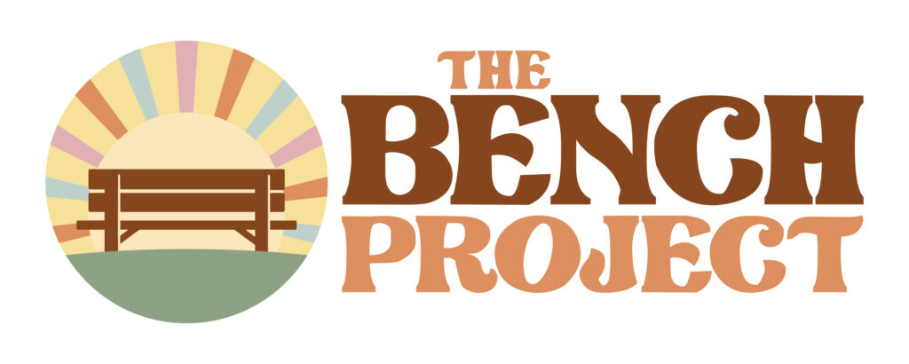
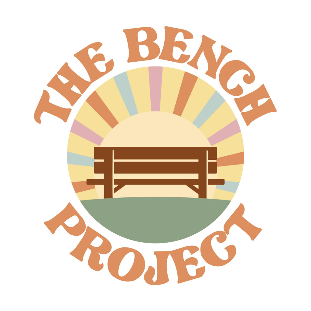
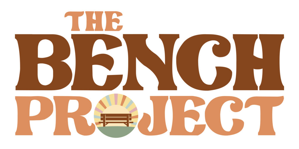
Matt created three logos for The Bench Project. They all have the same DNA, but with slight variations that can be used in different situations. The variations lead to a family of logos with legs.
Logo Creation Step 5: Review
After the internal process is complete, our collaborator is brought back into the mix. Typically, Matt will share three to five options for review.
“Before we send anything to the client I like to have them as polished as possible,” Matt said.
The subjectivity of design is really apparent at this stage. While Sam might send over an intricate logo that he likes best, the collaborator may have had a more simple presentation in mind. By giving them multiple options, the possibility of having to start from scratch is pretty low.
When the collaborator picks a favorite, they might request some changes. Colors, fonts and symbols are all up for discussion
“Once they see the base logo it’s usually just minor tweaks until we get it right,” said Matt.
We value this back and forth because in most cases we improve the end result with some client input. To keep the collaboration flowing, we don’t put a cap on the number of revisions.
Logo Creation Step 6: Completing the Logo
Once all parties agree on the logo it’s time to shine it up and send it out the door. The last step is for the designer to create high resolution final files in .ai, .eps, .pdf, .jpg and .png. This gives the business all the possible file types they might need going forward. For example an .eps file is best for printing on shirts while a Facebook profile picture works best as a .jpg.
Know the rules so you can break them
Design — like most creative endeavors — has its rules. A good designer knows the rules and follows them most of the time. But knowing the rules also gives creatives the chance to selectively break them.
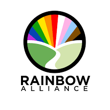
Rule: Stick with two colors
The book says logos should have a primary and a secondary color. For the rebrand of the Rainbow Alliance, Sam was asked to incorporate the Pride Progress flag into the logo. That flag has 11 colors. Instead of squashing the request, Sam weaved the colors into a logo that can change sizes without getting distorted. This logo isn’t conducive to black and white printing, but when your organization is called the Rainbow Alliance it’s a given that color is part of the brand.
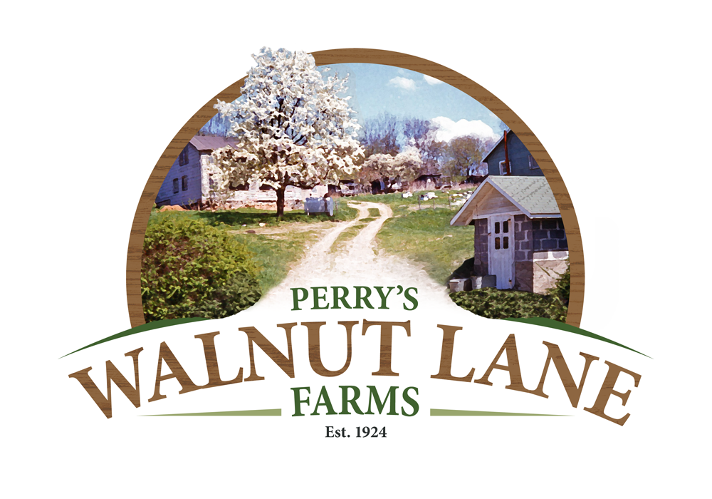
Rule: No Pictures
Logos that aren’t created as vector or line art and only use photo or .jpg files present a real challenge when the size needs to be changed. A blown up photo will look grainy or pixelated, while a downsized photo can look muddy and distorted.
Matt was presented with a rule-breaker’s dream when Perry’s Walnut Lane Farm asked for a logo using a photo from the farm. The image of a walnut tree lined lane with historic buildings kind of says it all. But the rules! Forget the rules!
Matt took the photo and created a vector image that delivers everything the photograph offers in a format that will function in different applications.
The Coal Difference
You may be saying, “That’s cool, man, but I can just make a logo on Canva or Microsoft Paint.” or “That’s cool, man, but I’ll save some cash and go with a designer on Fiverr.”
To that I say, that’s cool, man, but the results show that creative designers who leverage experience and training produce better logos. They put thought behind every decision, giving the final logo purpose and functionality.
Sam often compares templated design with Coal Creative as the difference between a suit off the rack and a tailored suit. A department store suit can look great, but a tailored suit just looks better. That’s because it is customized to fit a specific person. A logo is the same way. There is a big difference between a quick logo and a carefully crafted one.
Do you need a logo? Do you want Sam, Matt and Samantha to battle it out for logo supremacy, just for you? Fill out the form below and we’ll get in touch. Oh and don’t forget to stay Coal!
Leave a Reply