In the heart of Brooklyn, there’s a museum dedicated to the poorly executed ideas, the designs that make people squint and tilt their head, and the overhyped products that never shined. It’s the Museum of Failure, and design plays a central role in its exhibits [1].
Design aesthetics are tricky. Poor design is typically obvious (and sometimes obnoxious enough to create a museum from it), whereas beautiful, aspirational design isn’t so evident. From the simple handheld lighter to the pragmatic bullet trains—and even to our own brand-defining Coal Creative website, ahem—there are many examples of aesthetically-pleasing, functional design.
So, how do you amplify your aesthetics? To help aspiring artists, developers, and advertisers hash out some basic guiding principles, we asked our in-house designers Mia and Matt about their techniques.
In response, they gave us some insightful design do’s and don’ts.
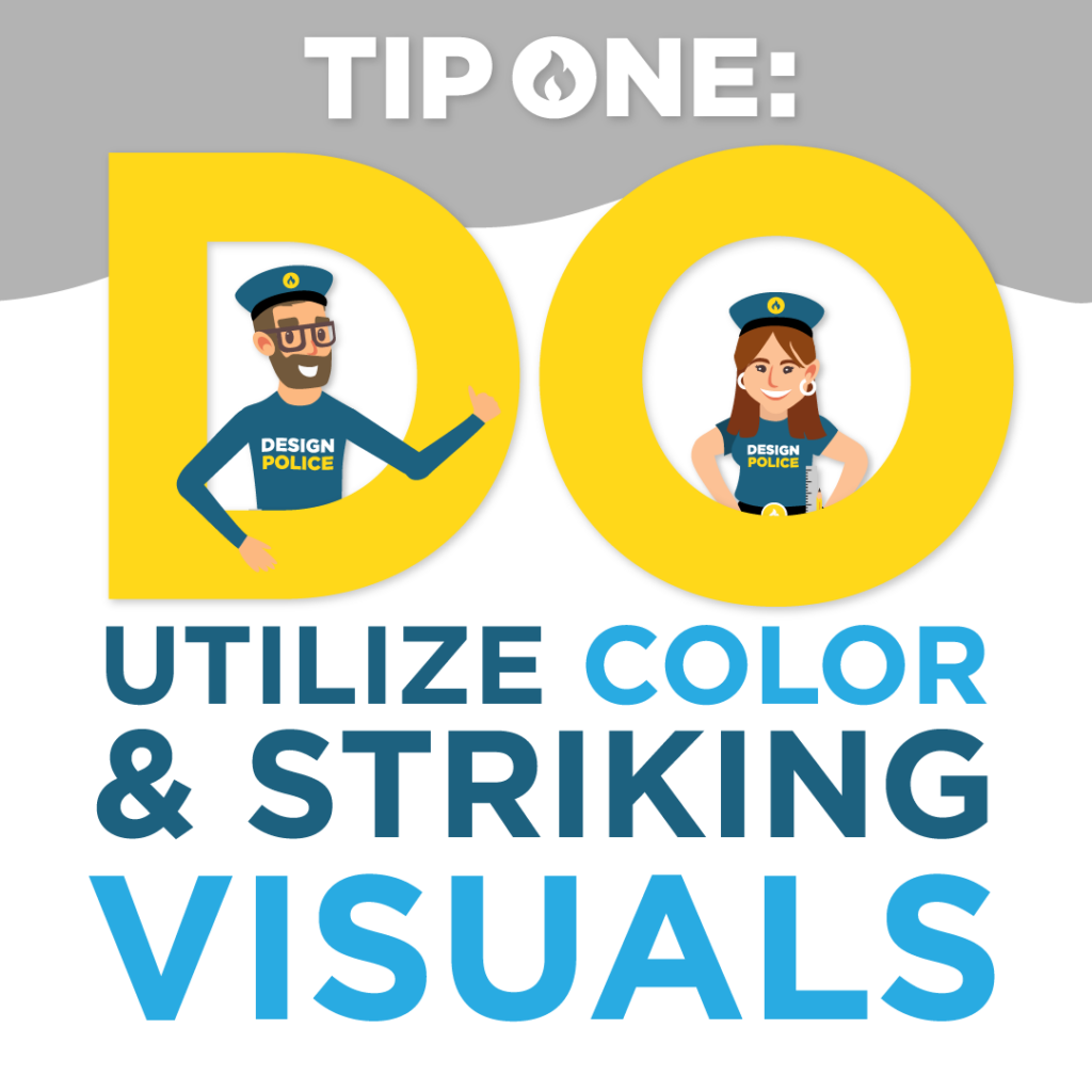
#1 DO Utilize Color and Striking Visuals
Mia reminds us of a basic universal truth that underpins good design: “people are drawn to colors and pictures from an early age. Whether it was comic books or Dr. Suess, I truly don’t think that ever goes away.”
Mia isn’t the only one who feels as such, and another reliable source—science—tells us the exact same thing. Humans are drawn to bright, warm colors and will routinely pick them over duller ones. In fact, some of the most attractive colors that immediately capture human interest include vibrant shades of red, blue, and green [2].
Using bright colors is a time-honored tradition with proven results. The longest-running and most popular animated television series of all time, The Simpsons, happens to use another rather captivating color: yellow.
When asked why his characters were their signature shade, creator Matt Groening answered: “When you’re flicking through channels with your remote control, and a flash of yellow goes by, you’ll know you’re watching The Simpsons.” Their sun-shaded skin has been luring viewers in since 1989, and it shows no signs of slowing down [3].

#2 DON’T Overcomplicate Things
Keep it simple, silly! Busy, overcrowded aesthetics are more likely to repel, rather than attract consumers to a product or service.
Both Matt and Mia explain the importance of striking a balance between text and graphic elements. The duo stress that designers should carefully think through their designs and sparingly utilize:
- Text, especially in large and varied fonts
- Graphics, such as images and logos
- Excessive contrasting colors
- Clutter
- Overcomplicated borders and backgrounds
- Fluff and unnecessary supporting elements
Essentially, concise and clear are better than convoluted and cloudy. According to Matt, when there’s too much going on with a design, it can be “difficult for the eye to know what to focus on.” Once again, science corroborates our designers.
Crowding is a visual phenomenon that occurs when reading ability, perception, and peripheral vision are impaired by excessive clutter. It can cause the viewer’s eye to overlook or become confused by an image, rather than interpret it and assess its contents. It can happen with dense urban environments, busy natural landscapes, or particularly bad design [4].
So, before pasting in that sweet clip art or wordy paragraph, consider whether your design really needs it or not.

#3 DO Practice Consistently and Trust Your Instinct
People feel fantastic design when they see it. So, if you believe you’ve really made something exceptional, Mia thinks there’s “a 50% chance people will agree.” She believes much of design revolves around gut instinct, so if something feels right, it probably is—and if it feels wrong, it likely needs to be 86’ed.
Matt champions the power of practice in perfecting your design skills. “Try a little bit of every type of design: branding, advertising, illustration, etcetera,” he recommends. So, whether you’re drawing comics on your kitchen counter or plotting out billboards for Times Square, you’re honing your ability to create aesthetically-pleasing designs.
While the myth of the 10,000-hour expert has been thoroughly debunked, putting in over a year of time practicing drawing and designing certainly wouldn’t hurt anyone’s skills [5]. As you develop as a designer, you’ll also naturally come to trust your instincts more—meaning making those gut decisions will feel easier with time.
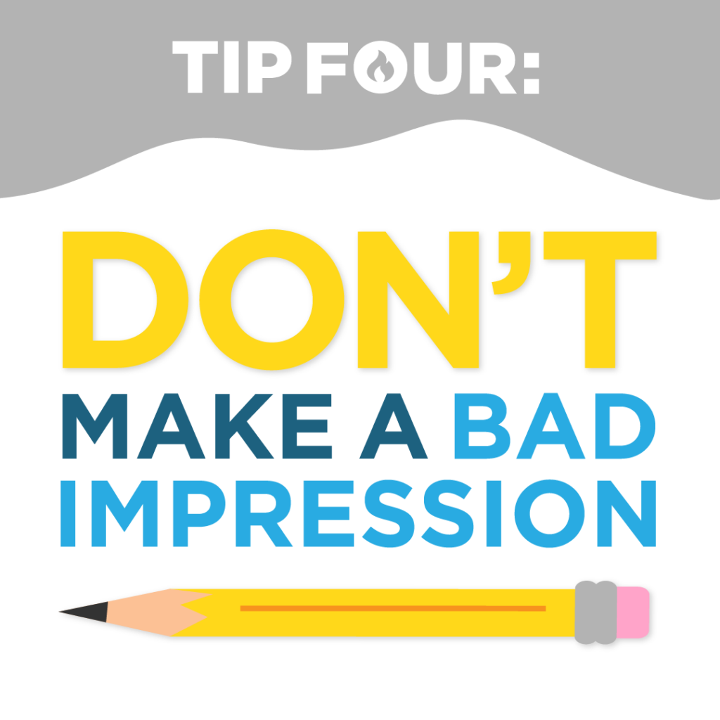
#4 DON’T Make a Bad First Impression
Matt reminds us that “a company’s branding or advertising design is the first thing people see from them a lot of the time, so if it’s done really well it can create a great first impression.” The flipside of this undeniable truth, of course, is also true.
Keep in mind, when designing for a company or corporation, your chosen aesthetic will represent more than your own sensibilities—it will speak for an entire organization. Studies show that consumers place more trust in companies with legitimate, professional aesthetics—especially on their websites [6].
Light the Design Fire With Help From the Coal Creative Design Team
To make a memorable first impression, remember these key design principles:
- Utilize bright, vibrant shades that immediately capture people’s attention
- Minimize clutter and conflicting colors
- Practice your craft, share with others, and incorporate feedback into your designs
- Go with your gut—it’s probably guiding you in the right direction
If you’re looking for a design partner, reach out to the Coal Crew today—we’d be happy to chat through your project.
Sources:
[1] “Brooklyn’s newly opened Museum of Failure celebrates bad ideas, silly designs and overhyped products.” March 22, 2023. CBS New York. [Online] Available: https://cbsnews.com. [Accessed May 15, 2023]
[2] “Why We Prefer Certain Colors.” April 1, 2011. Psychology Today. [Online] Available: https://www.psychologytoday.com. [Accessed May 15, 2023]
[3] “Hotseat: The Simpsons creator Matt Groening.” July 25, 2007. British Broadcasting Corporation. [Online} Available: http://news.bbc.co.uk. [Accessed May 15, 2023]
[4] Whitney, D., & Levi, D. M. March 21, 2011. “Visual crowding: a fundamental limit on conscious perception and object recognition. Trends in cognitive sciences. [Online] Available: https://doi.org/10.1016/j.tics.2011.02.005. [Accessed May 15, 2023]
[5] “Why Gladwell’s 10,000-hour rule is wrong.” November 13, 2012. British Broadcasting Corporation. [Online] Available: https://www.bbc.com. [Accessed May 15, 2023][6] “Trustworthiness in Web Design: 4 Credibility Factors.” May 8, 2016. Nielsen Norman Group. [Online] Available: https://www.nngroup.com. [Accessed May 15, 2023]
Leave a Reply